Fashion Ecommerce Website
Client
Miik
Services
Web design
UX design
Miik is a Canadian sustainable fashion brand making comfortable clothing for women. I redesigned their Shopify website using customer feedback to identify and resolve user pain points. I was responsible for wireframes, site mapping, visual design and development.
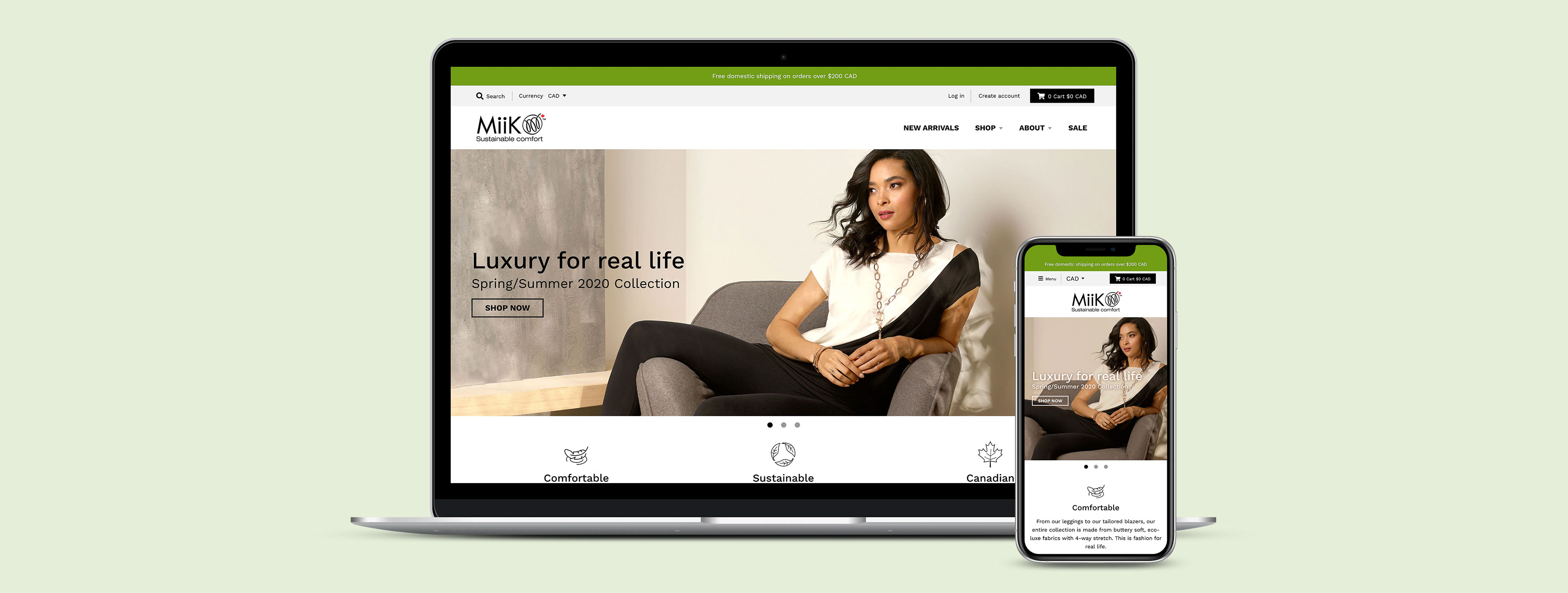
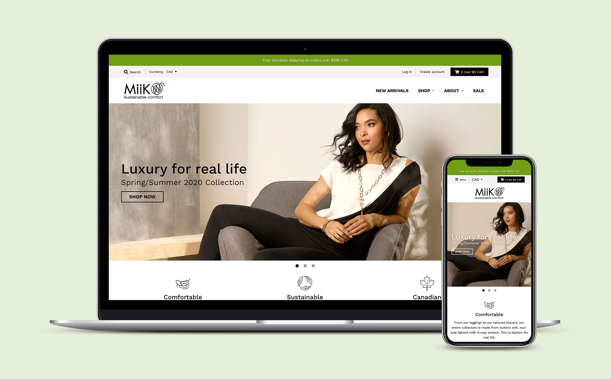
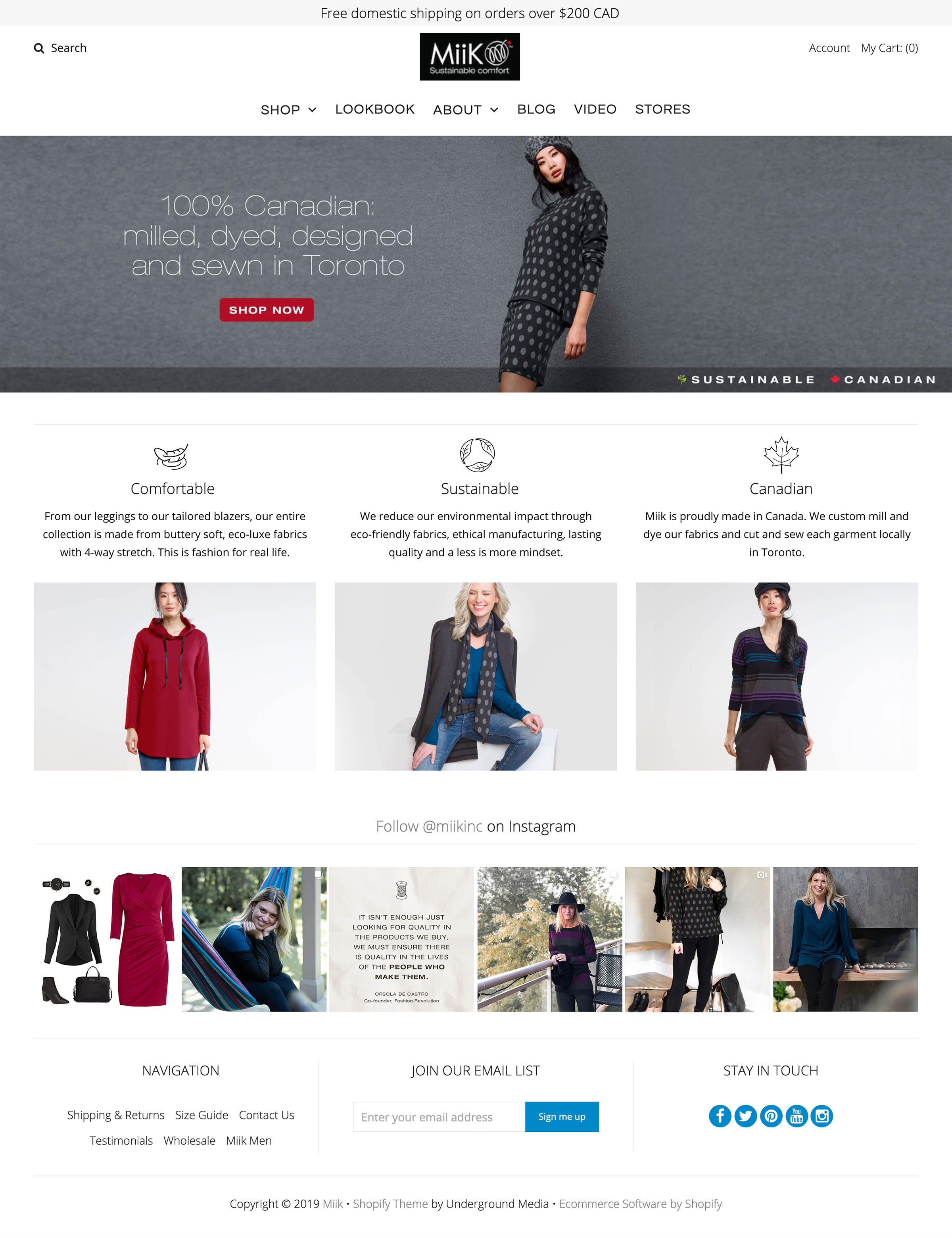
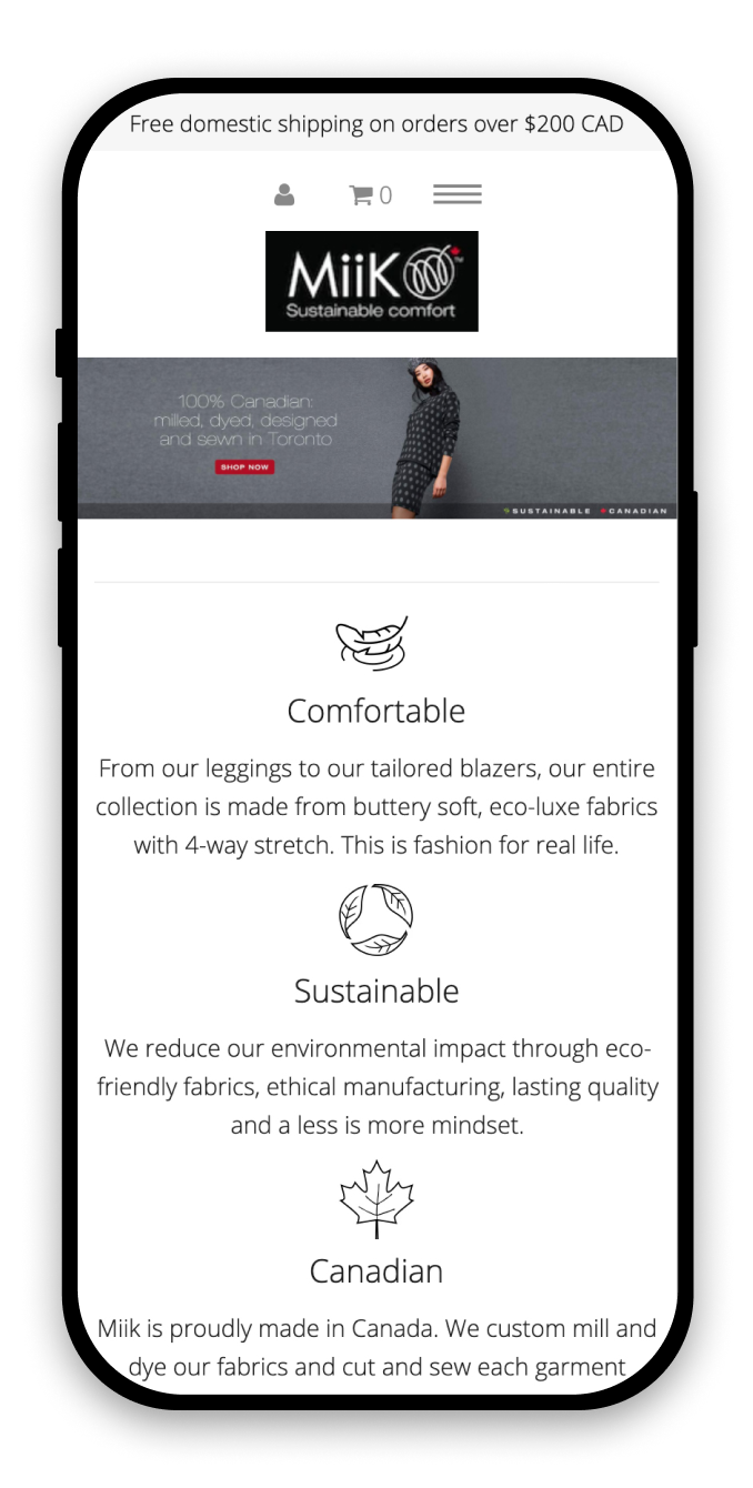
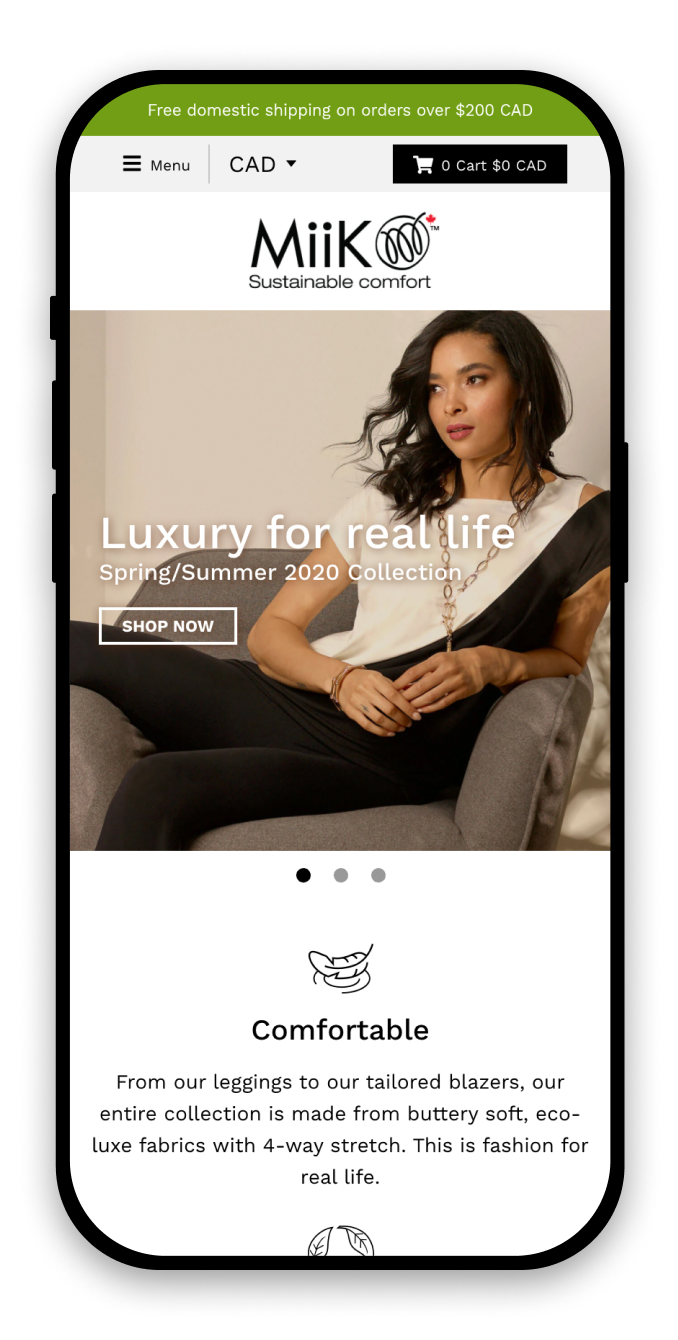
Homepage
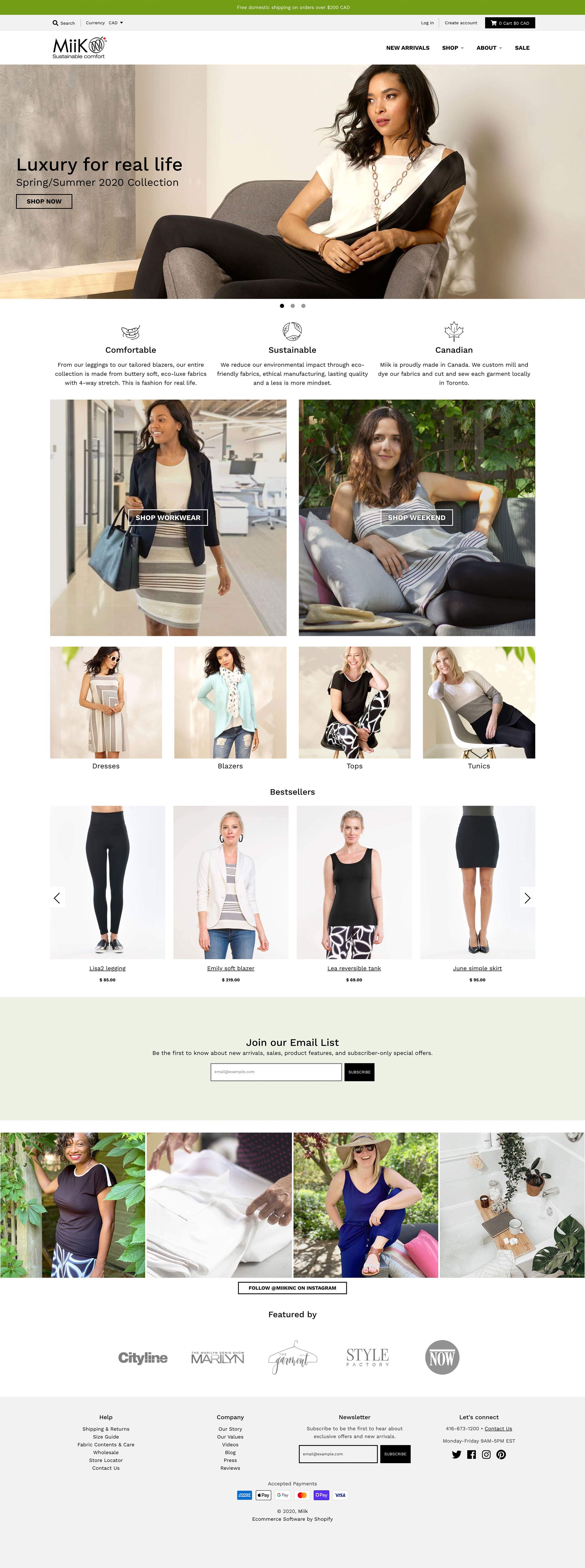
The previous homepage had very little content and didn’t display well on mobile devices. The redesigned page now has a responsive hero image, links to featured collections, a carousel of bestselling products, and press logos to build credibility. The result is a page that better represents Miik’s offerings and invites visitors to start shopping.
Across the website, I reorganized the main navigation menu, putting the two most visited pages (“New arrivals” and “Sale”) at the top level for easy access. The footer menu has been expanded to hold frequently visited links and organized into “Help” and “Company” categories.
Before
After
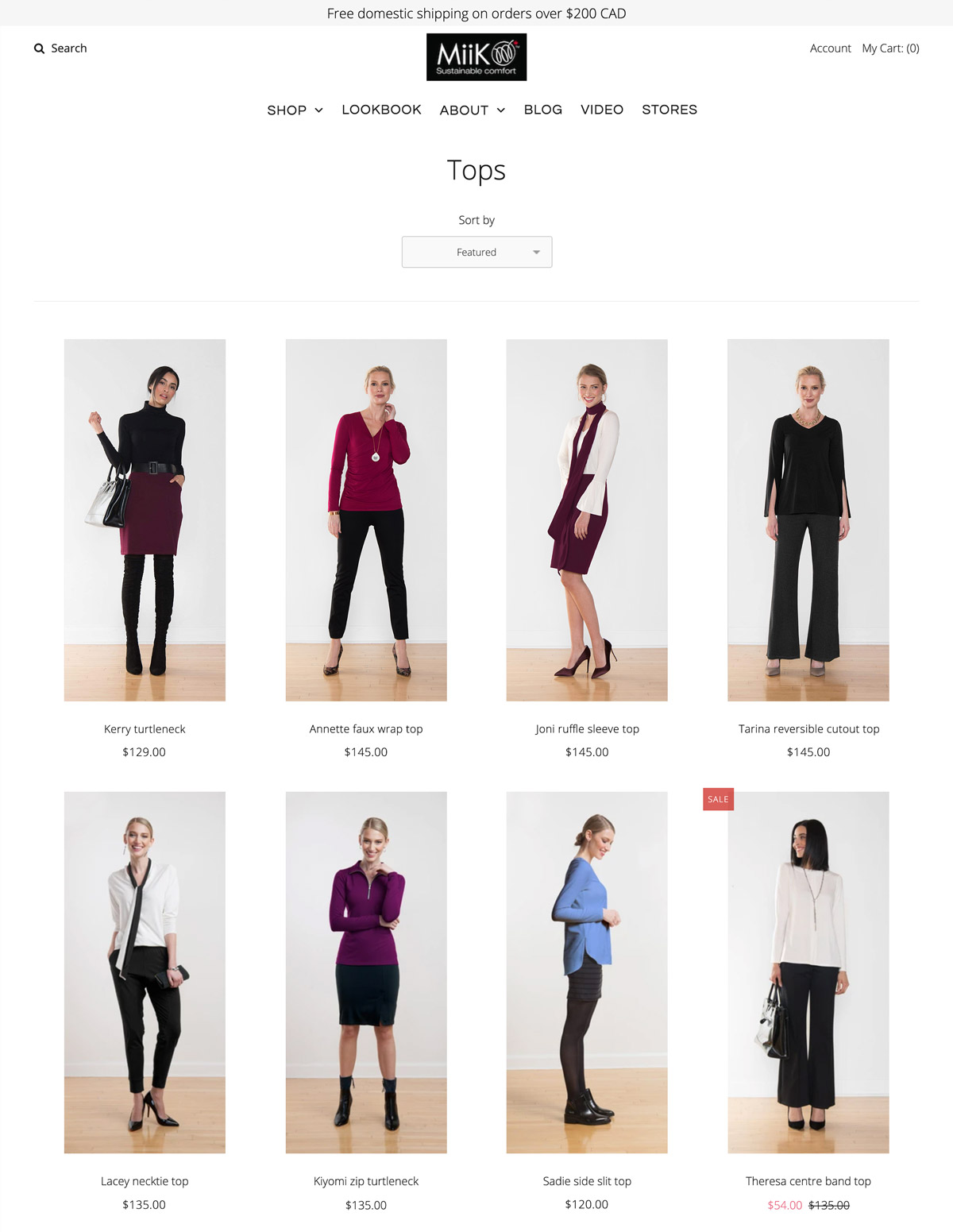
Collection Page
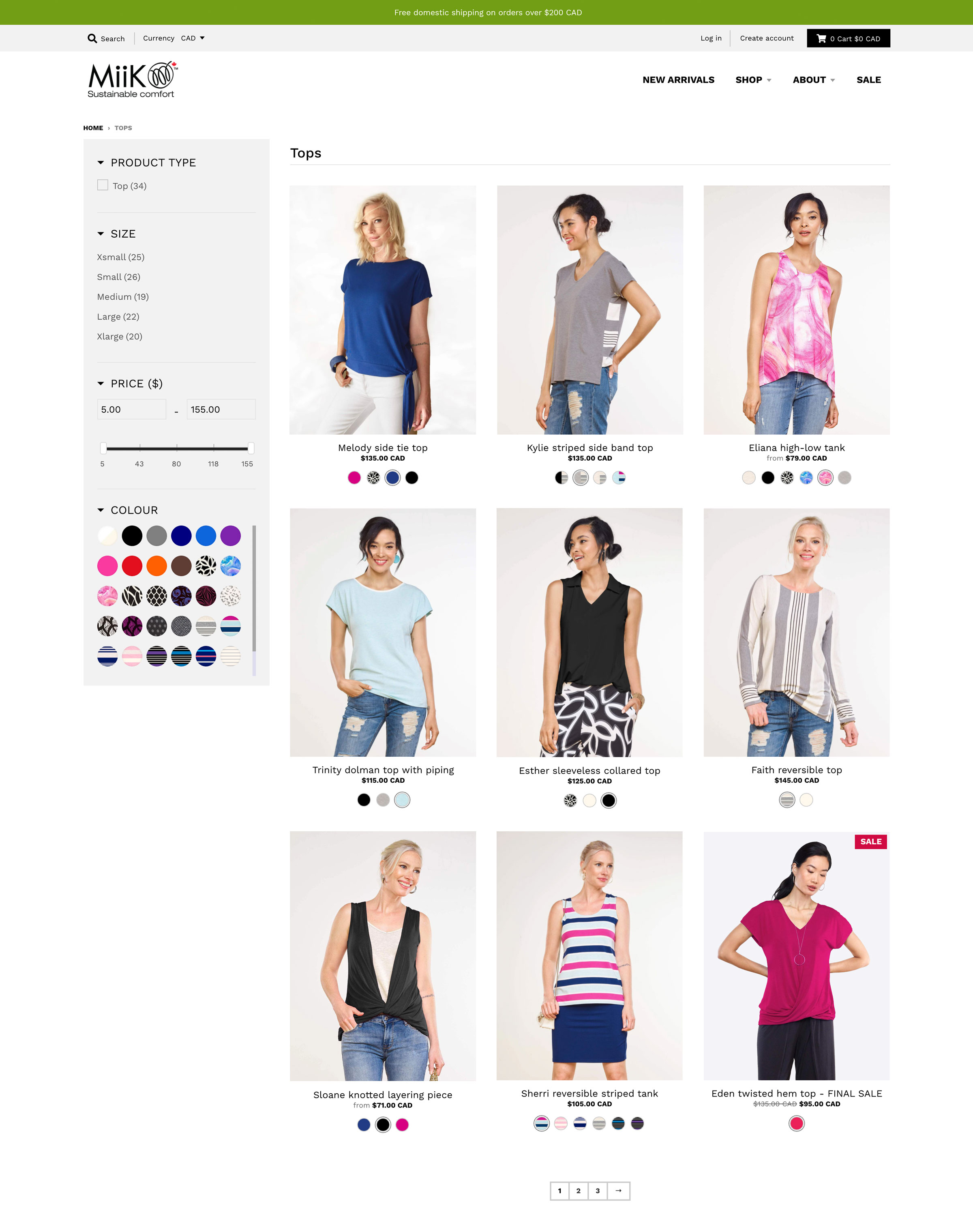
One of customers’ biggest frustrations with the previous design was that it was difficult to quickly find products available in their size. I used a third-party app to add product filtering based on type, size, price and colour. Colour swatches under the product images on collection pages indicate available options and allow users to preview each colour before visiting the product page.
I revised how product photos are cropped, focusing on a single item rather than showing a full outfit with multiple products (ie. cardigan, blouse, and pants). It’s now easier to browse as the user no longer needs to read the product name to know which product is the focus.
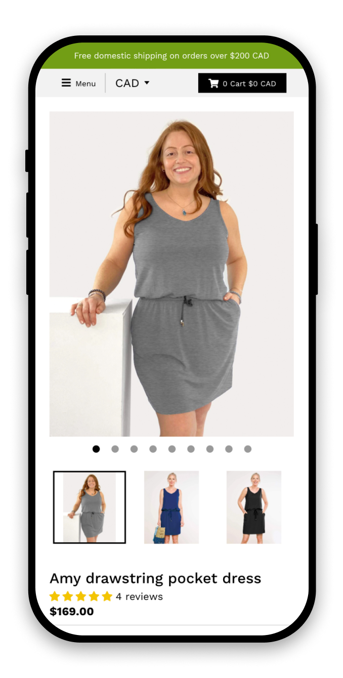
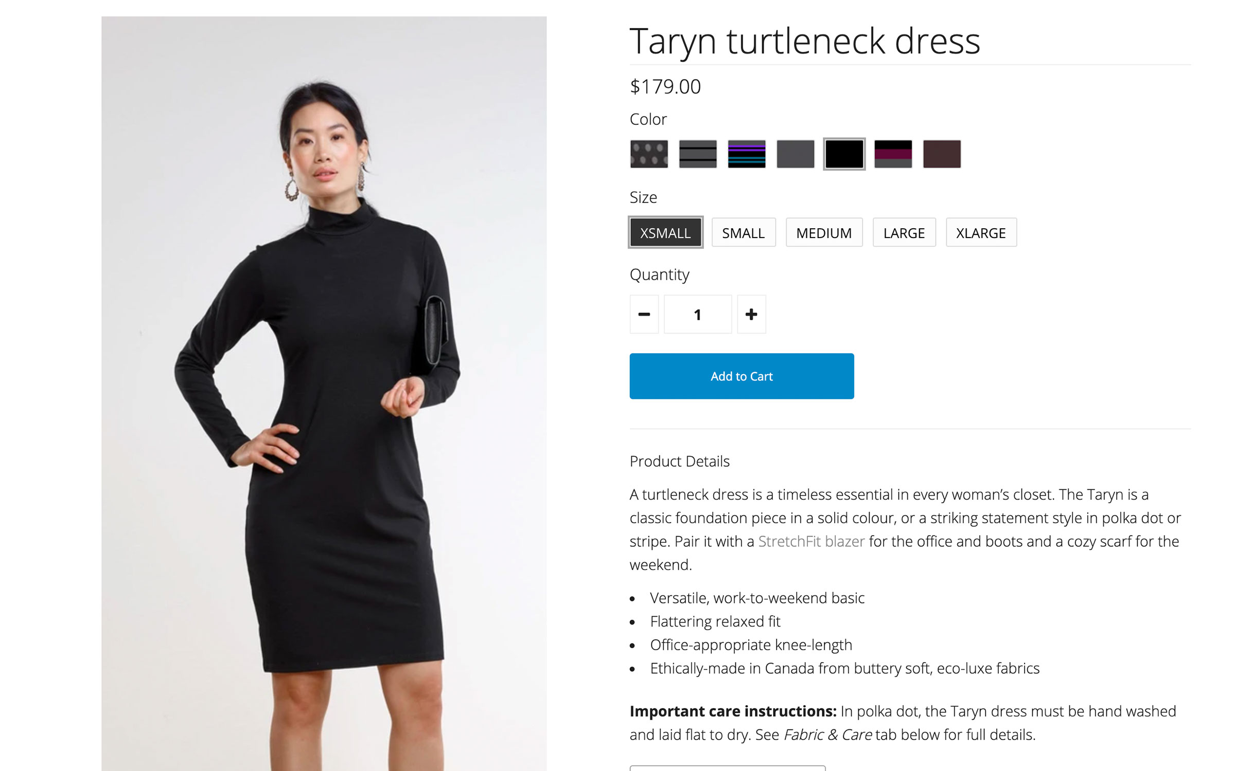
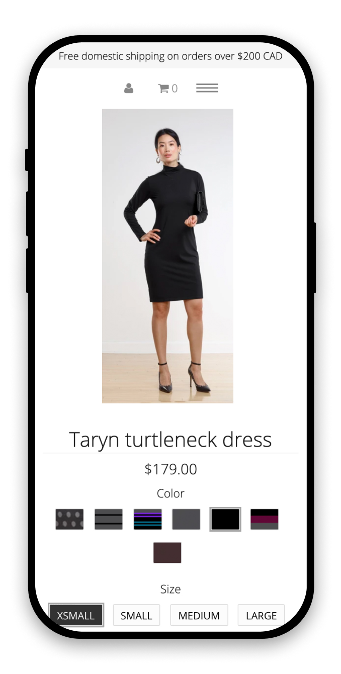
Product Page
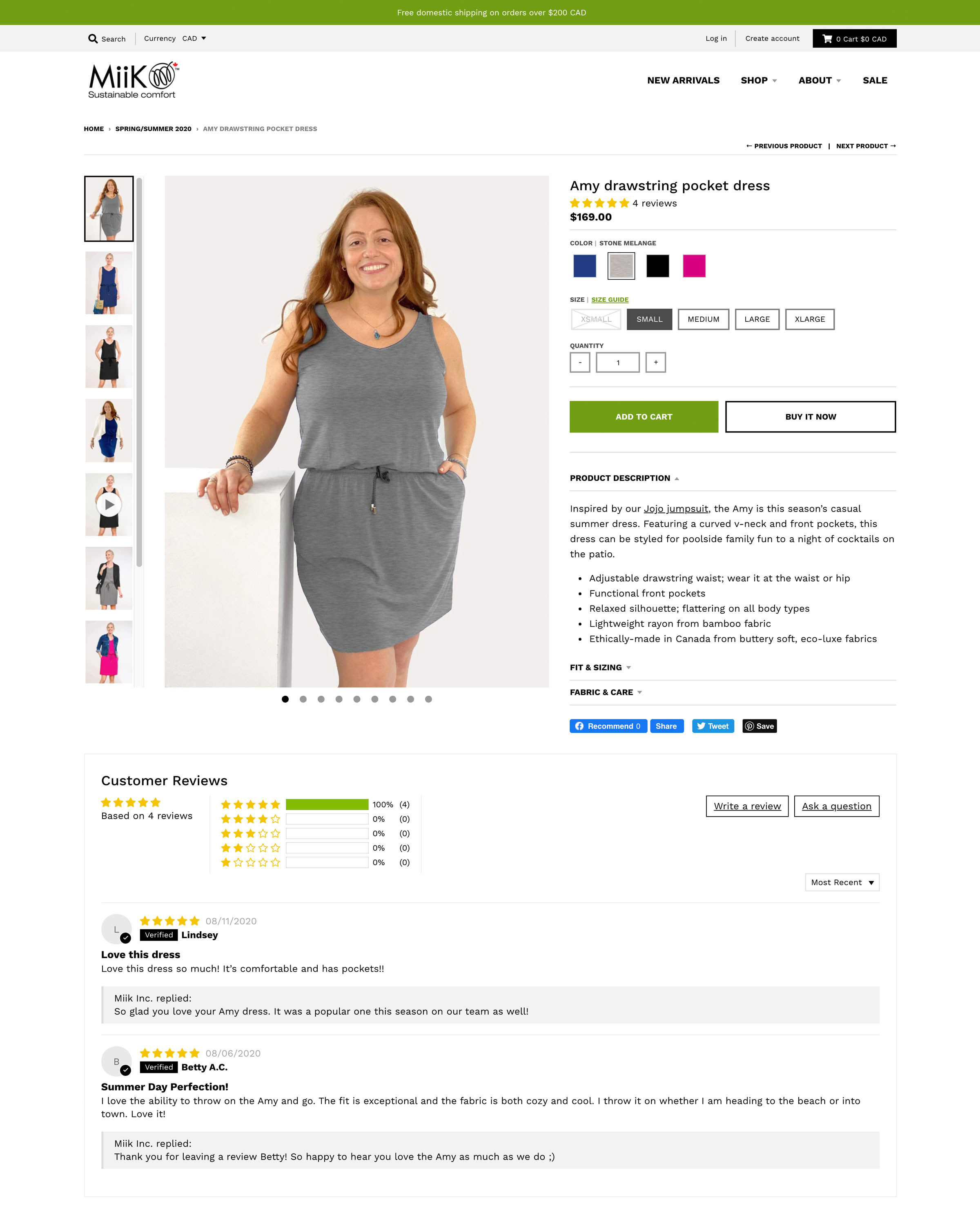
On the old product pages, the size selectors didn’t have a disabled state, so it wasn’t obvious which sizes were sold out. Now, unavailable sizes are light grey, crossed out, and can’t be selected by the user.
I cropped product images to a 3:4 ratio, which scales to fit comfortably on most desktop and mobile devices. Previously, product photos were tall and narrow—nearly a 2:5 ratio—and were getting cut off on smaller displays.
Thumbnail images for additional product colours have been moved up into the first viewport and are now visible on mobile, with navigation dots to indicate where more photos are available.
Before
After