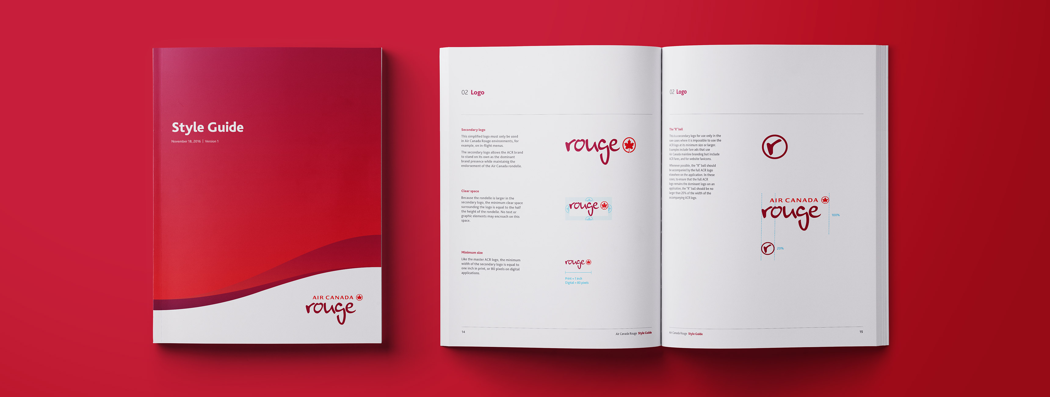
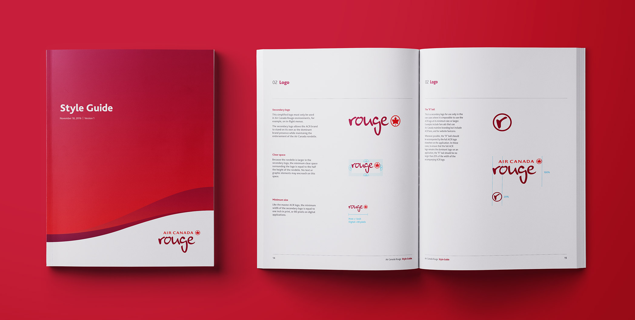
Cover and interior spread from the Air Canada Rouge style guide

Brand Style Guide

Client
Air Canada Rouge

Agency
J. Walter Thompson

Services
Identity system design
Print design

To complete the development of a new corporate identity for Air Canada Rouge, I created a 90-page style guide detailing all aspects and applications of the new system. I determined the specifications for the brand’s visual application, including the rules for sizing, spacing, and arranging typographic and visual elements on print and digital applications. I wrote all of the supporting copy describing these rules and specifications.
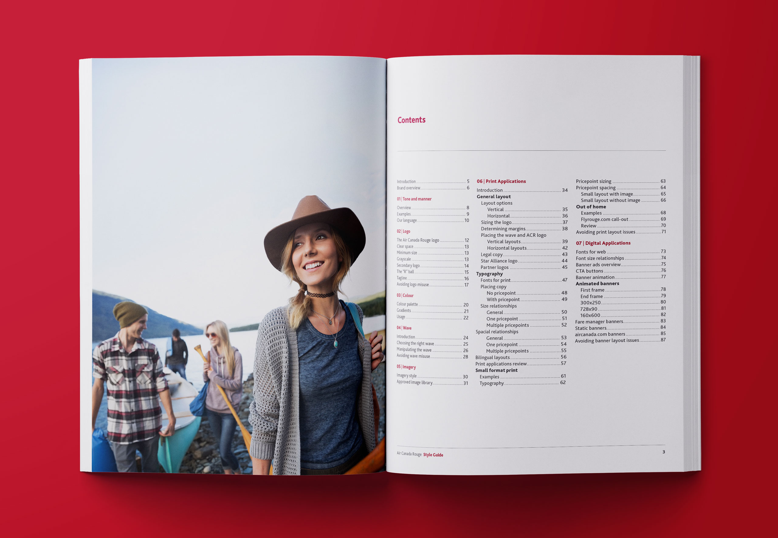
Book spread with a large image of a smiling woman by a lake on the left page and a table of contents on the right
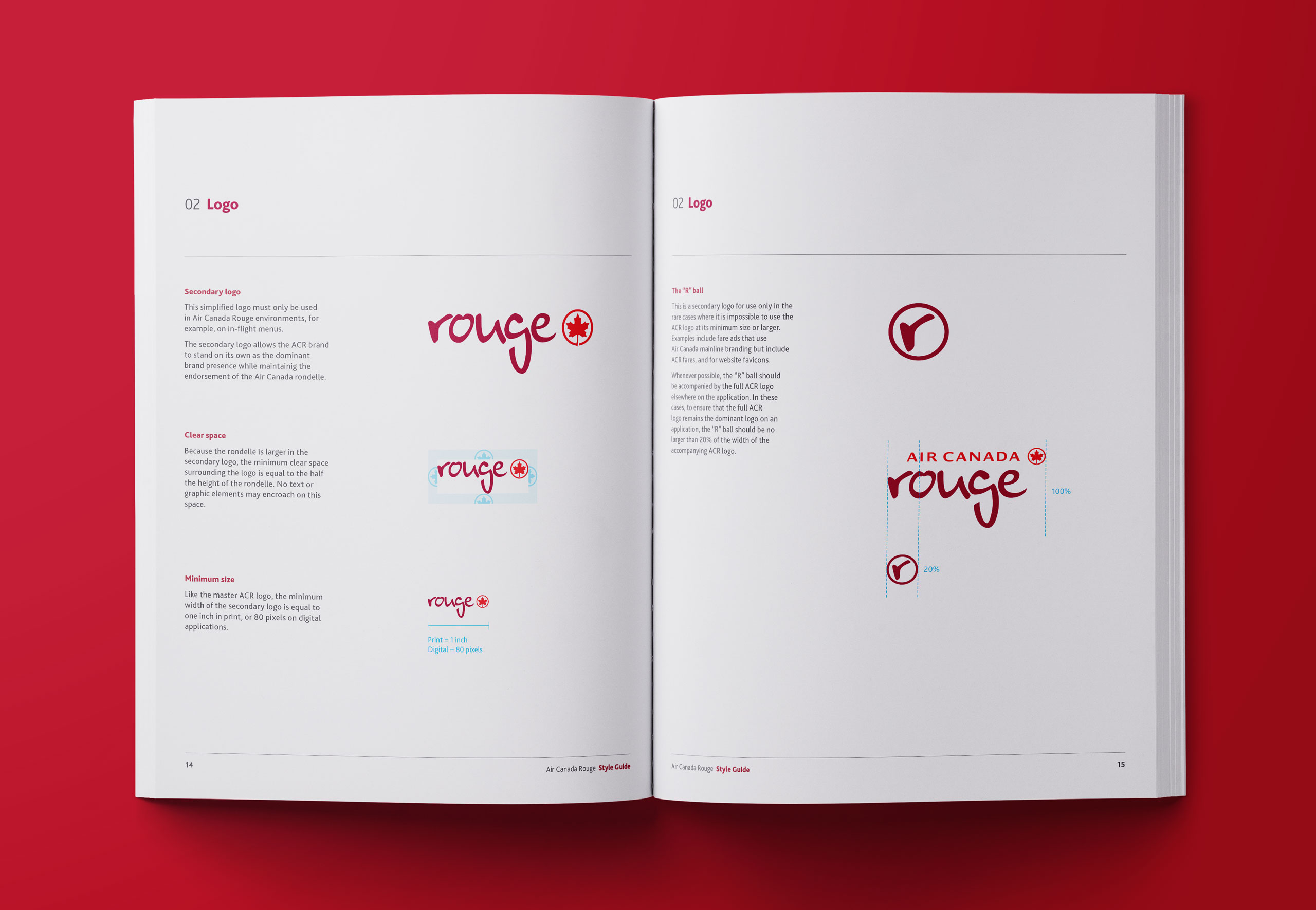
Book spread showing rules for sizing and clear space around the Air Canada Rouge logo
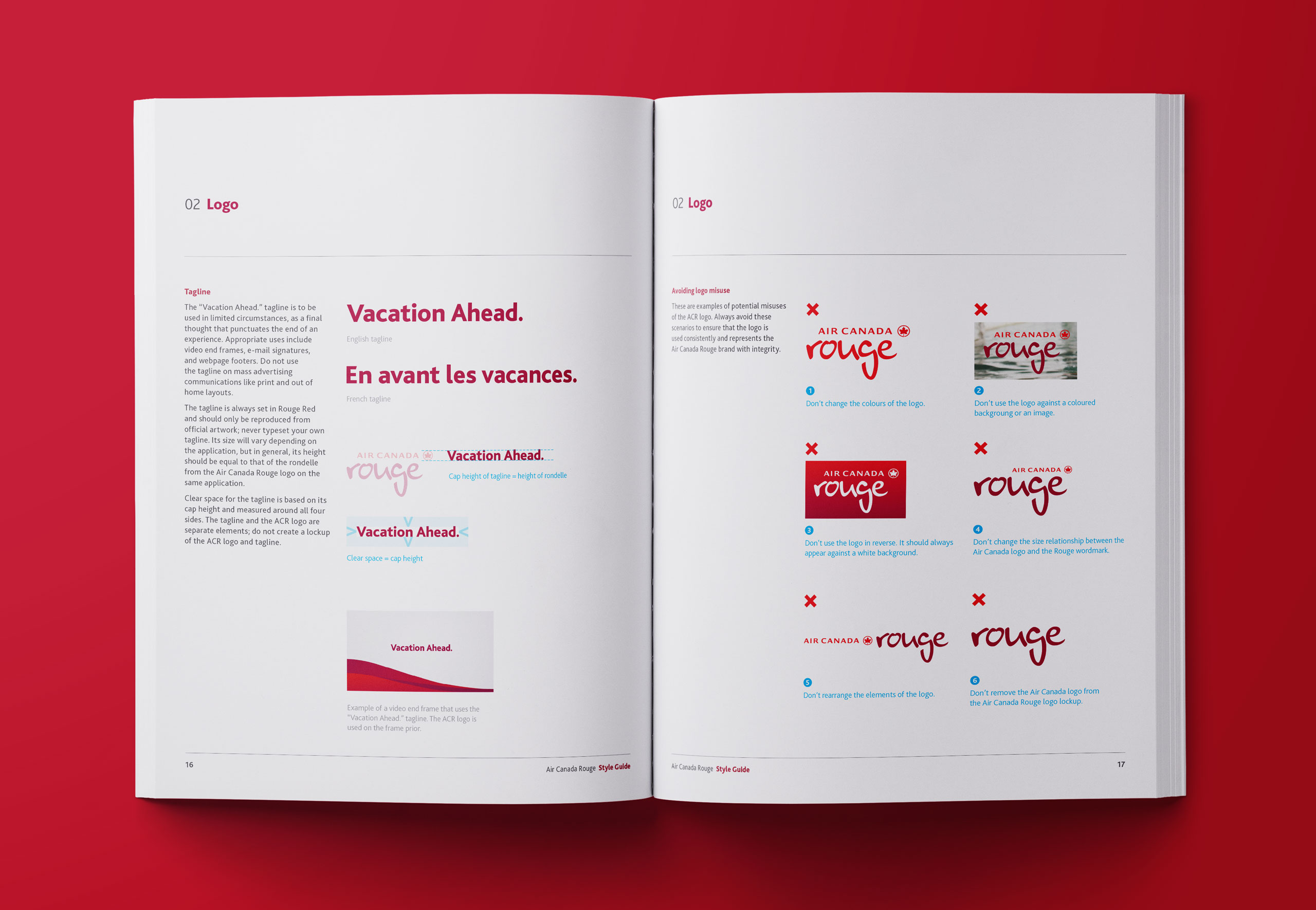
Book spread showing examples of how the Air Canada Rouge logo might be misused
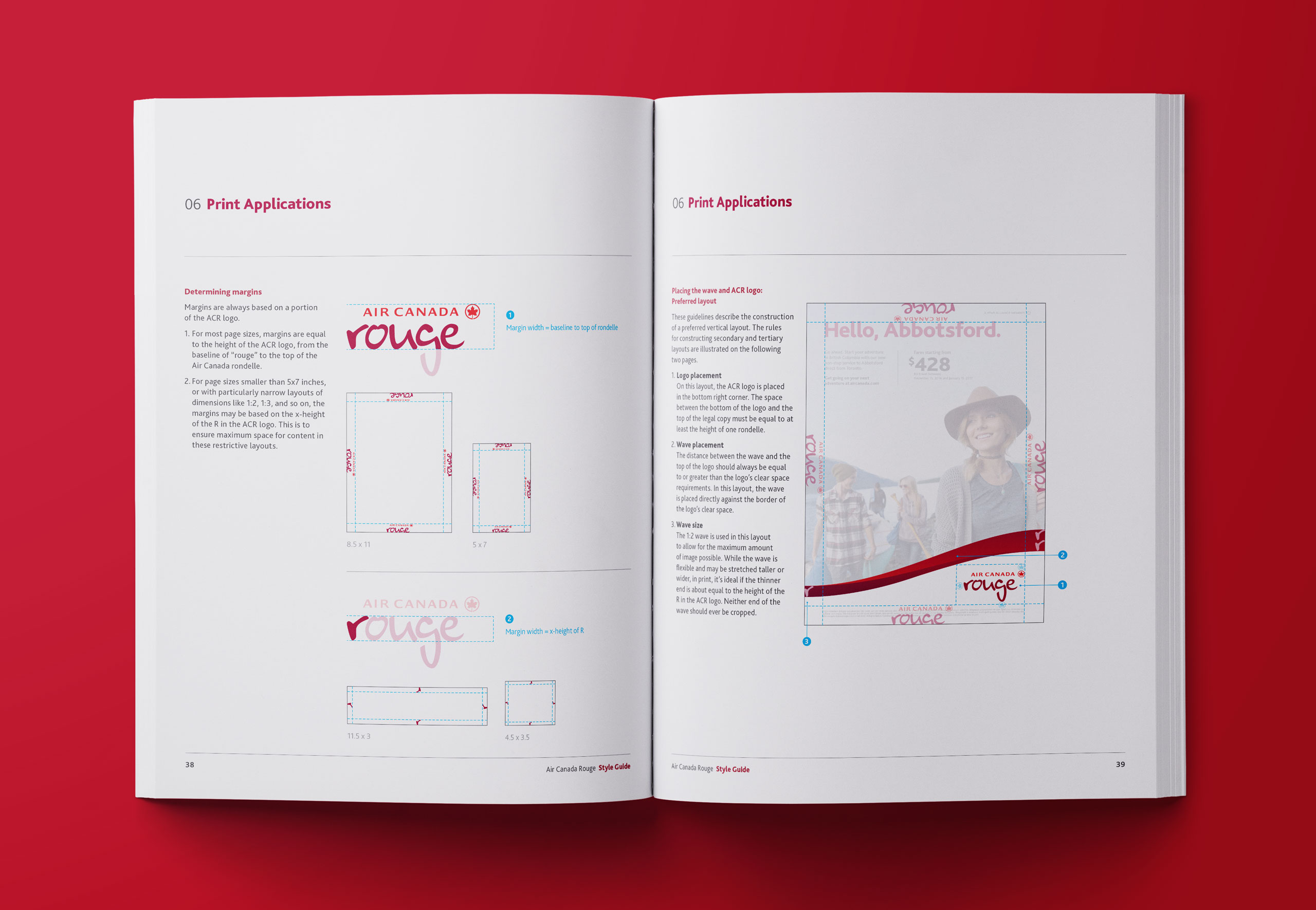
Book spread showing how to determine margins and graphic sizing on a print application
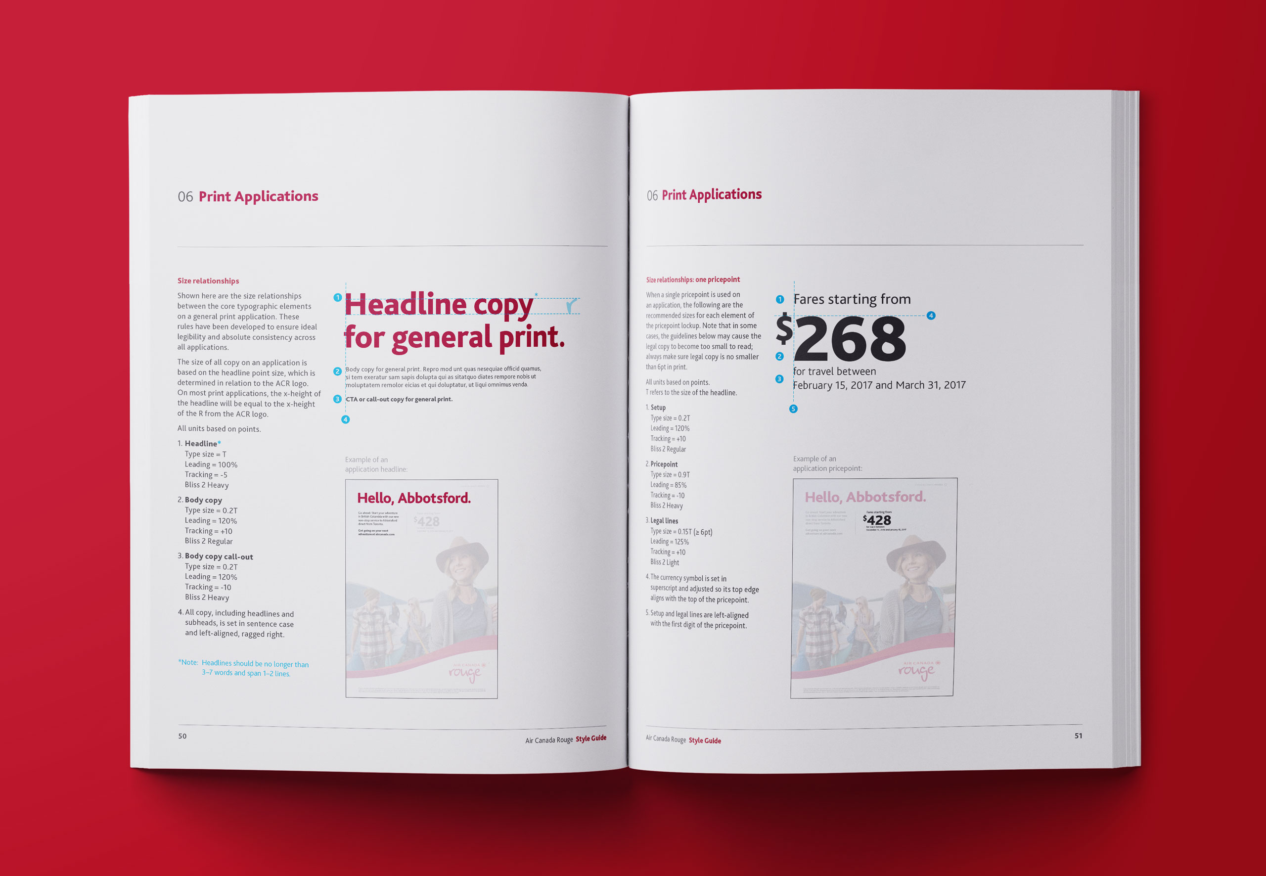
Book spread showing how to size headlines and pricepoints on print applications
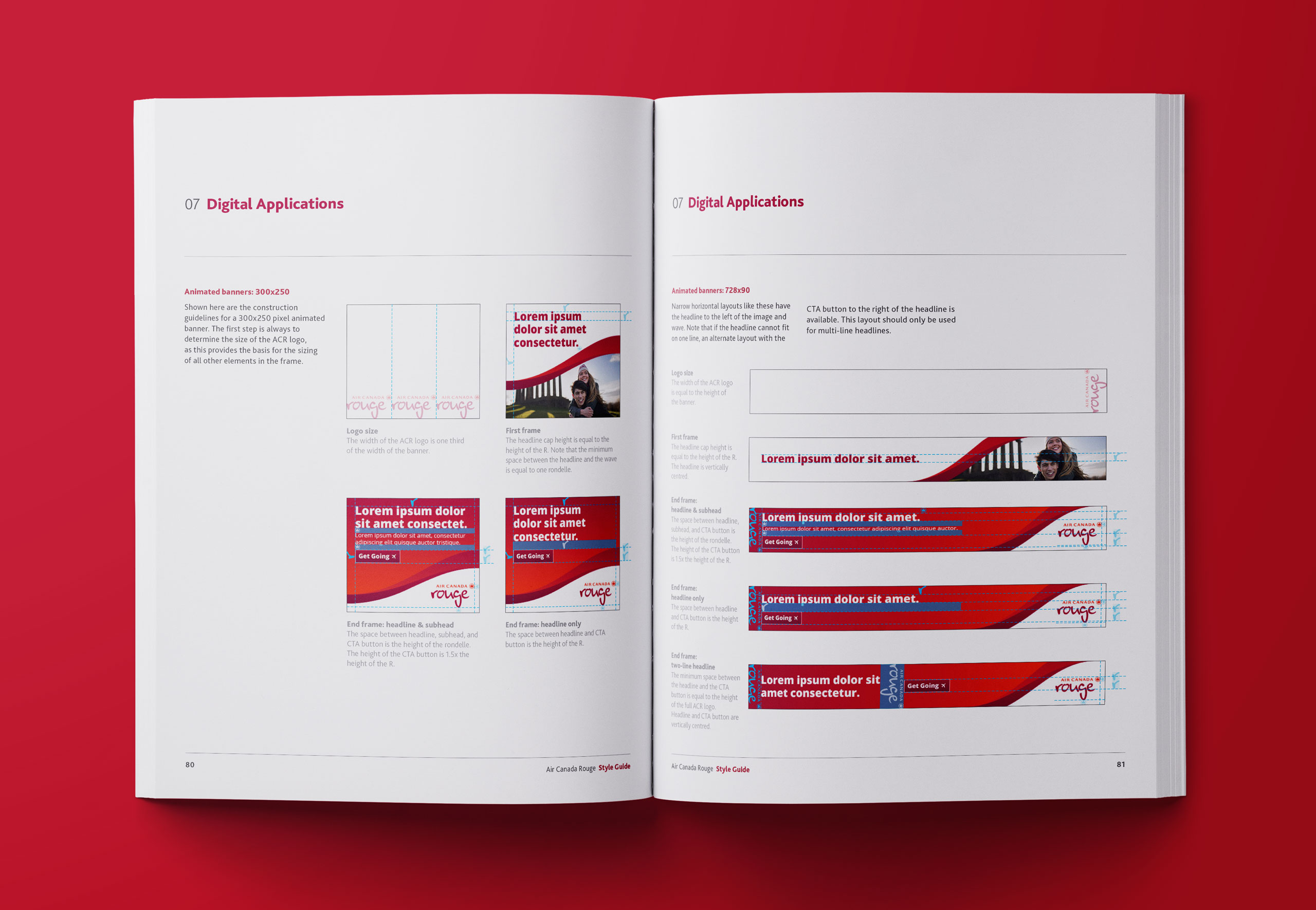
Book spread showing examples of frames from animated banner ads