
Online Grocery UX Design
School
Juno College
Brand
Metro
Services
UX research
UX/UI design
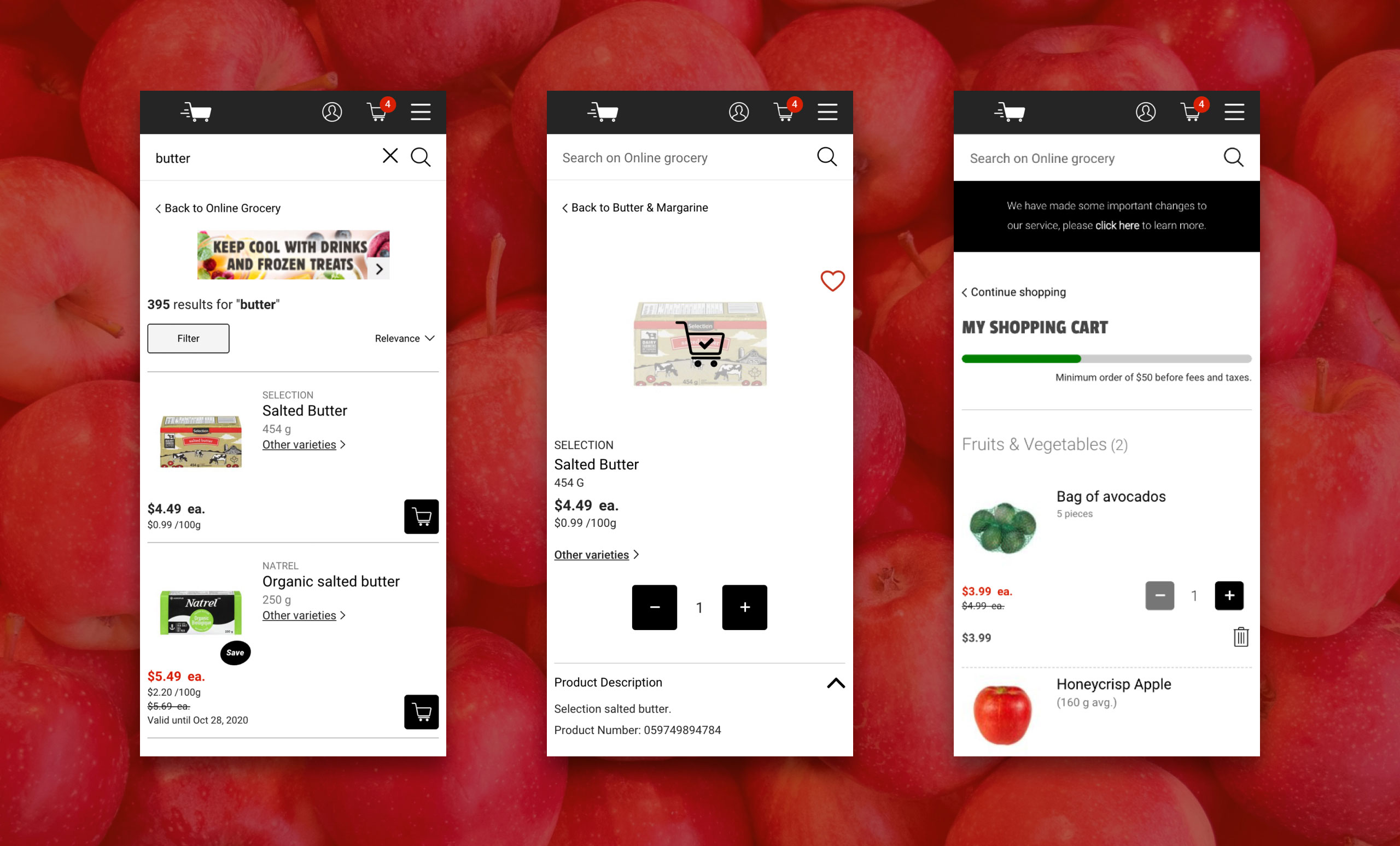
This was a student project undertaken as part of the UX Design fundamentals course at Juno College. The task was to analyze, critique and redesign a user experience flow for an online grocery delivery platform. I chose Metro Online Grocery and my research led me to focus on how users are able to specify substitutes for unavailable items in their order.
Research Objective
The goal of my research was to discover the needs and preferences of people in the Greater Toronto Area who use online grocery delivery services. I wanted to find out:01
What problems are users trying to solve by choosing online grocery services?02
What problems do they encounter when using these services?
Methodology
Interviews
I conducted one-on-one interviews over Zoom with 3 participants, all young professionals in the GTA with previous experience using at least one online grocery service.
Observation
I observed each participant as they used the Metro Online Grocery website. Participants were asked to complete a series of tasks, including searching for and adding items to their cart, editing their selections, and proceeding through checkout.
Affinity & Empathy Mapping
I used empathy mapping (what users say, do, think, and feel) and affinity mapping (shown below) to synthesize the data from my user interviews.
Heuristic Analysis
I evaluated the Metro Online Grocery website against Jakob Nielson’s 10 Usability Heuristics for User Interface Design and identified basic web accessibility issues.
Competitive Analysis
I analyzed six of Metro’s competitors, comparing aspects of their online grocery services including minimum order amount, fees, delivery window selection, product information, item substitution, pricing, and loyalty programs.
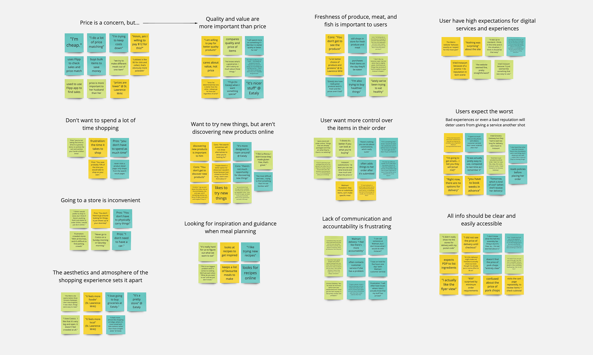
Insights
From my research, one of my key insights was that users were frustrated by an inability to communicate with the person who would ultimately be shopping for their grocery order. They were unable to give specific instructions and were often disappointed by inappropriate substitutions and missing items.
“They had also missed items or substituted items and that’s not usually great for when I’m trying to cook a specific meal.”
– Interview participant
Problem Statement
How can we deliver a way for online grocery customers to communicate specific preferences when placing their order so that it is more likely they will receive the exact items they want and will continue using Metro Online Grocery?
Ideation & Wireframes
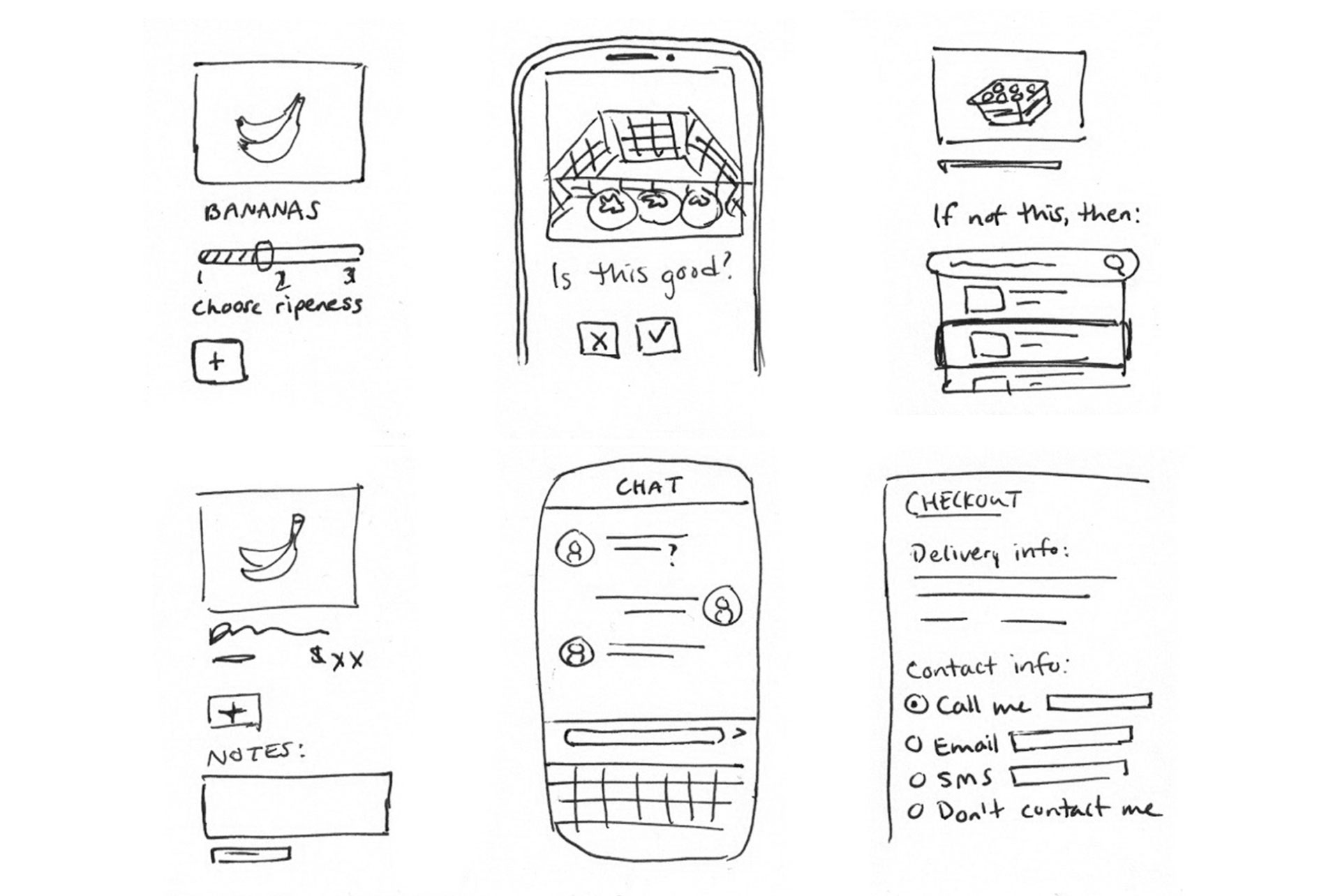
In my research, I found that users weren’t visiting product pages while shopping. They were more likely to quickly add items to their cart from the search results and category pages. Thus, I focused my solution on the shopping cart, as all users must visit this page before checkout.
The solution I developed included:
An accept/reject substitutions toggle for each item in the cart
A way to search for and select preferred replacement items
Space to add notes for each item in the cart
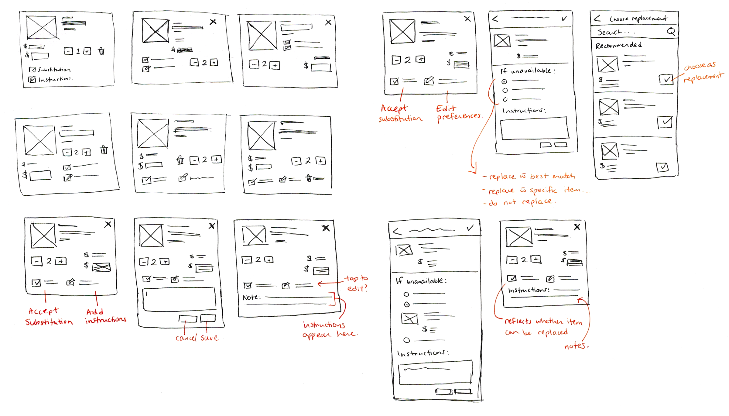
Usability Testing with Lo-Fi Prototype
I built my lo-fi prototype with Sketch and InVision and conducted one-on-one remote usability testing with six participants over Zoom. Each person was given four tasks to complete, which required:
- accepting the “best available” substitution for an item
- rejecting all item substitutions
- choosing a specific replacement item
- adding notes to their order
Key problems identified during usability testing
01
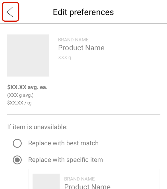
Users hesitated when leaving the item “Preferences” screen; it wasn’t clear if their selections and notes would be saved.
02
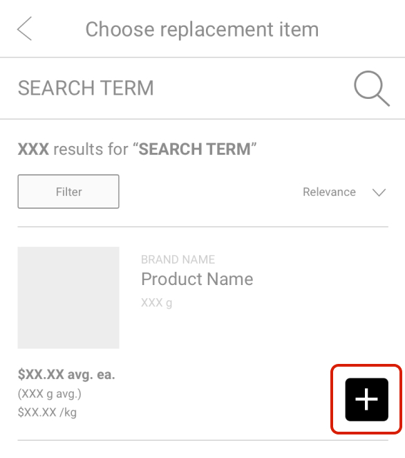
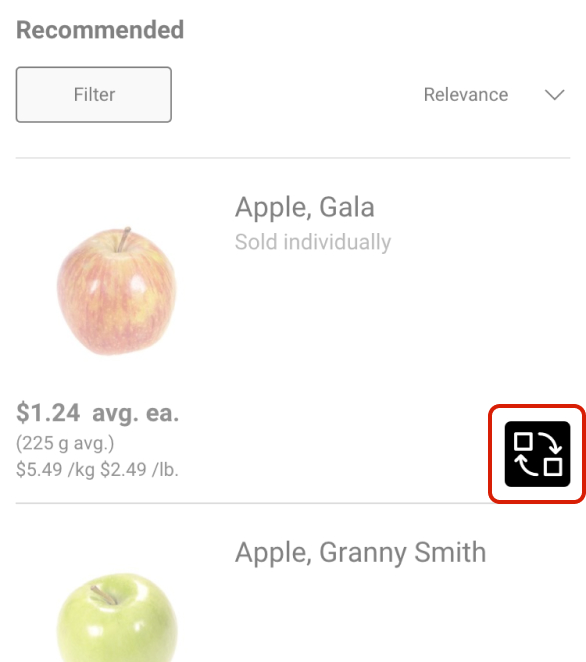
Users had trouble selecting a preferred replacement item from the search results screen; they didn’t know they had to tap the [+] button to make a selection.
03
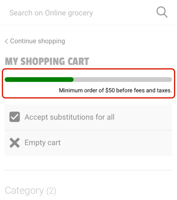
Users found the minimum order requirements unclear; they wanted to know exactly how much more they needed to add to their cart before they could begin checkout.
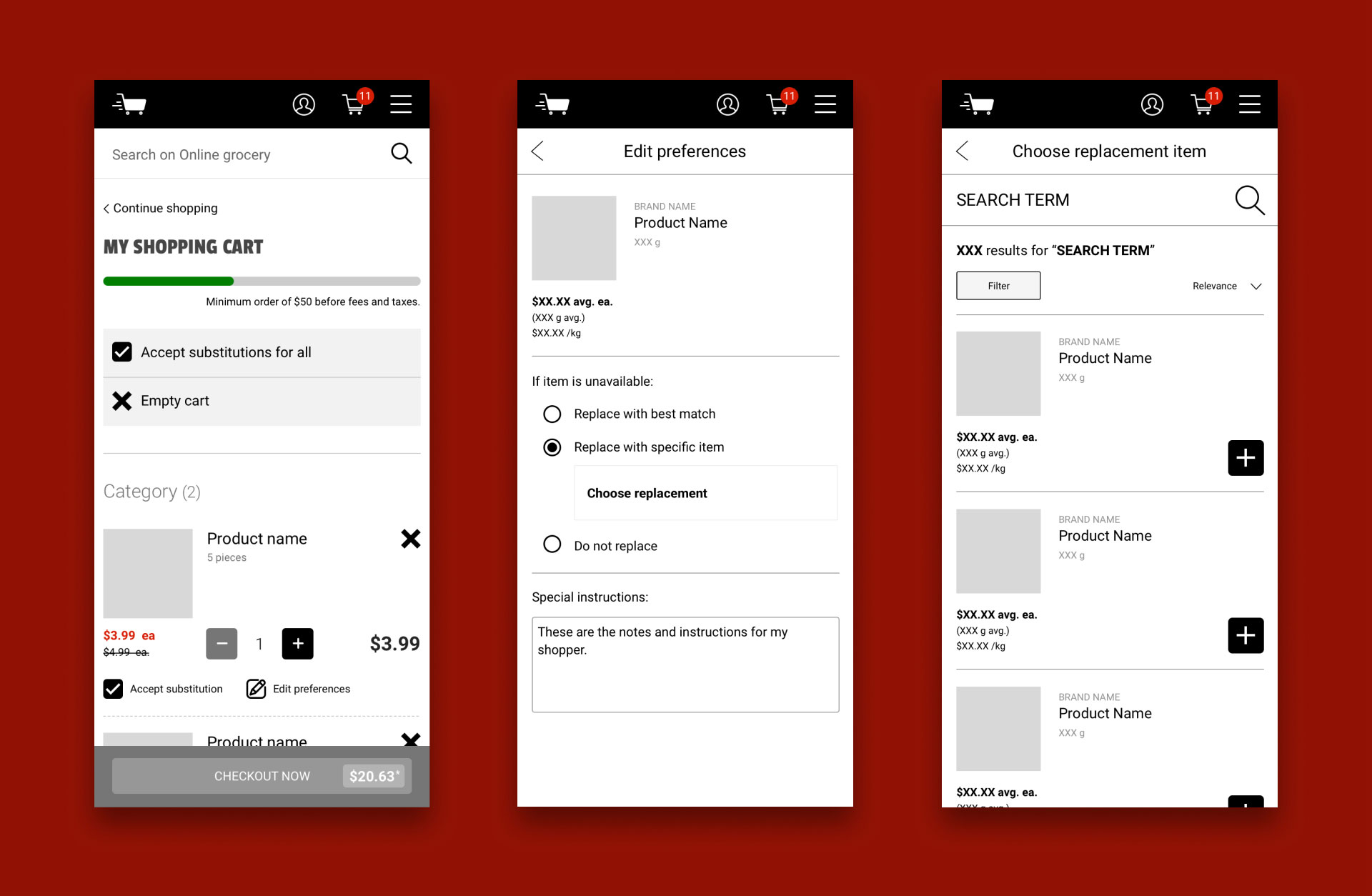
Hi-Fi Prototype
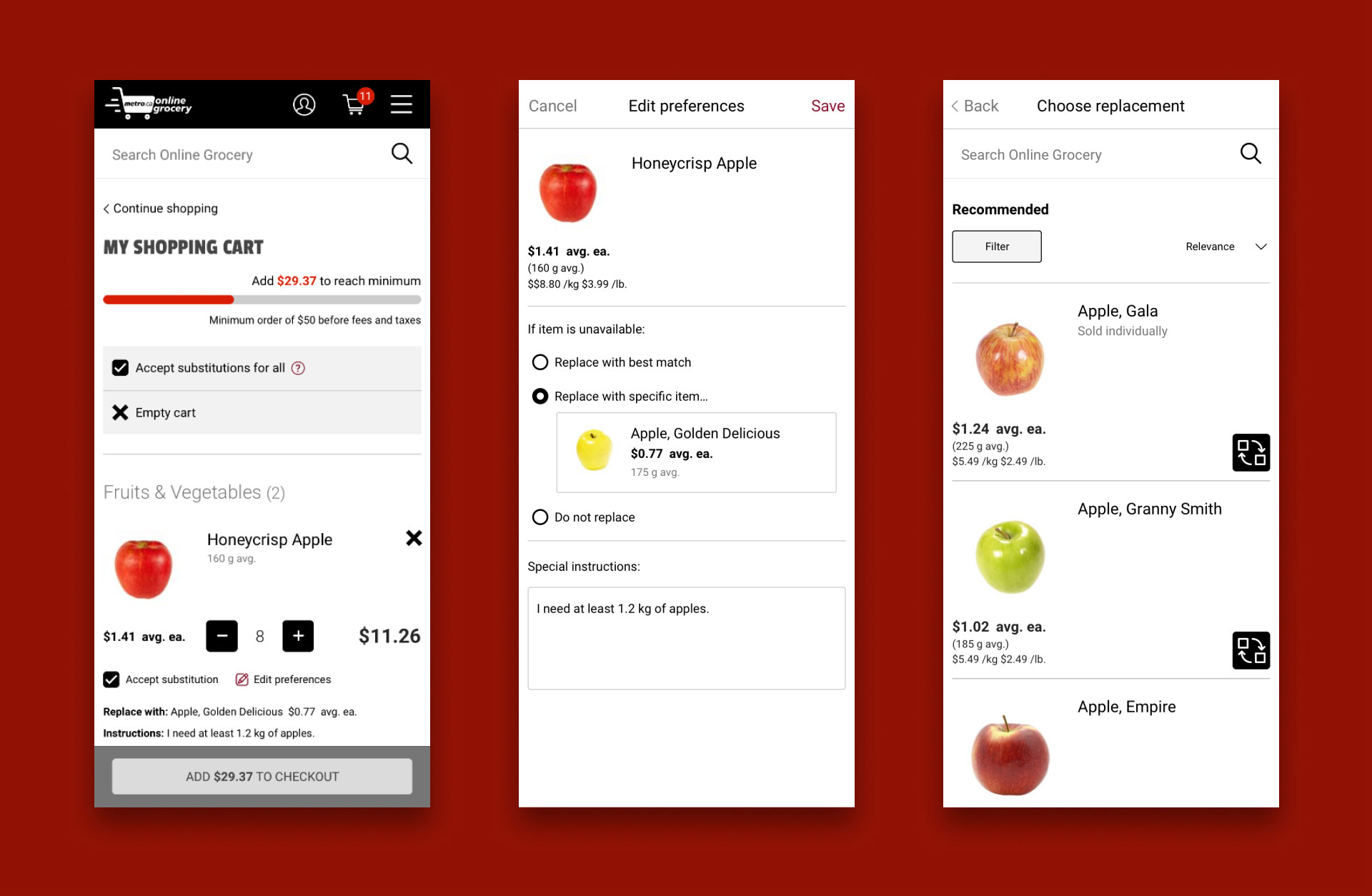
The final high fidelity prototype could be used to complete the following tasks:
- accept/reject substitutions at cart level
- accept/reject substitutions for the Honeycrisp apple
- search for and select Golden Delicious as the preferred replacement for the Honeycrisp apple
- add notes to the Honeycrisp apple
In this iteration of the prototype, I addressed the findings from my usability testing by:
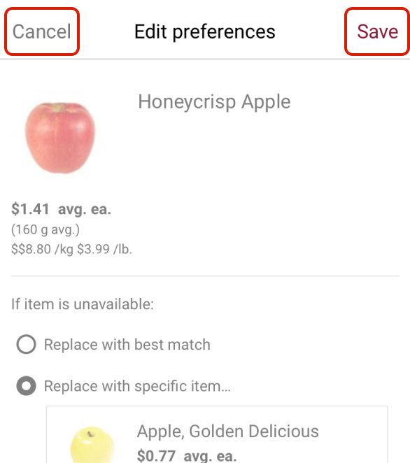
01
Adding “Cancel” and “Save” buttons to the item “Preferences” screen.
02
Changing the icon on the button used to select replacement items.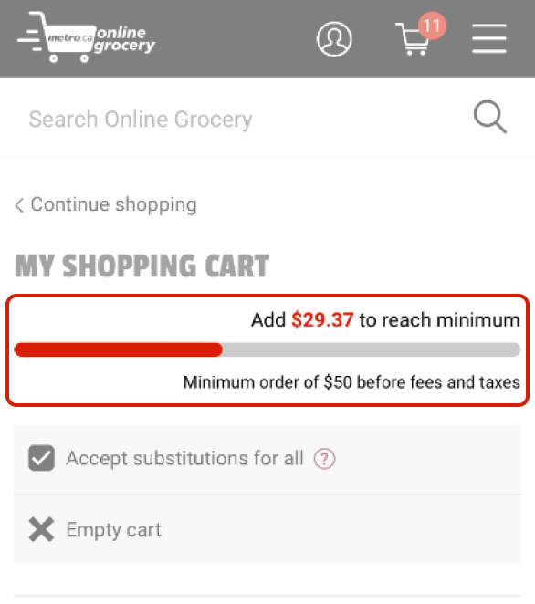
03
Adding a dollar value to the progress bar in the shopping cart to indicate how much more was needed to meet minimum order requirements.
Summary
My solution allows customers to communicate their preferences specific to each item in their cart. They can offer detailed instructions and choose a specific replacement item in case a product is out of stock.
The success of this solution is highly dependent on the shoppers who fulfill customers’ orders; however, if shoppers follow the instructions provided, orders should have fewer missing items and customers should be more satisfied with the items they receive.